MITOSIS — 2024
Long form collection

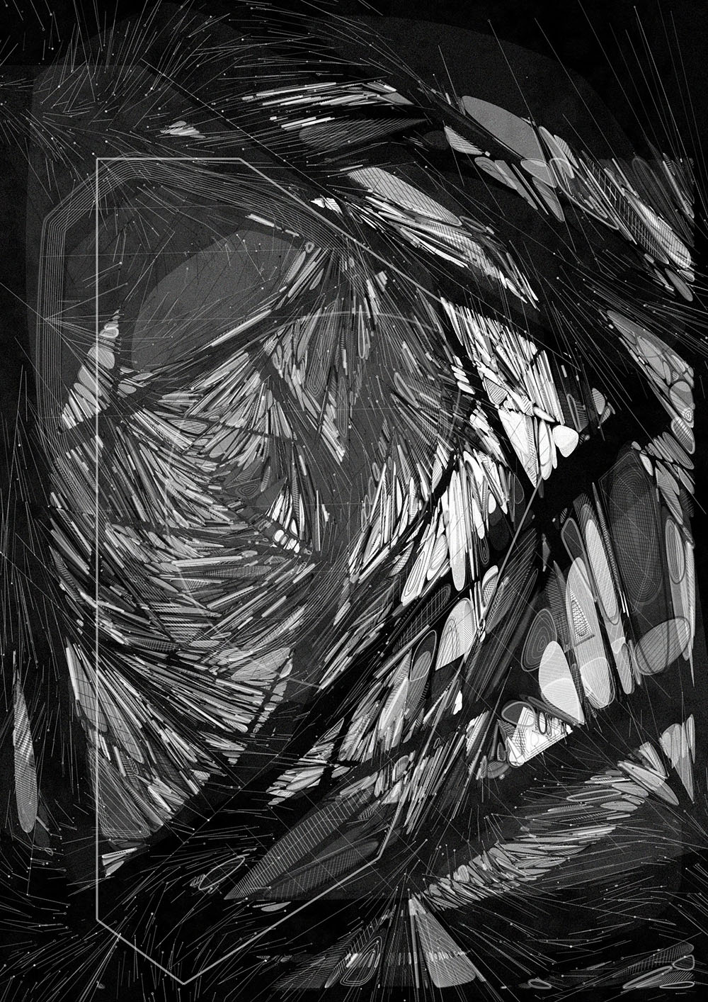

Mitosis — An architectural approach to cellular biology
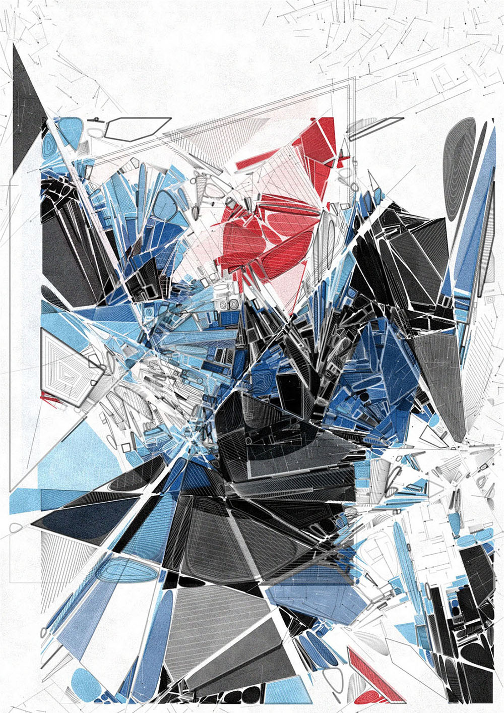
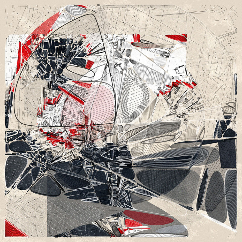
This generative art collection is an exploration of the fundamental processes that drive both the natural and the constructed worlds around us. It presents a visual narrative bridging cell biology and architectural design. Just as cells undergo mitosis, dividing and evolving, our man-made structures, too, emerge, adapt, and redefine the spaces they inhabit. Surprisingly, at an appropriate scale they can display striking parallels and even share a similar visual language. The intricate patterns, reminiscent of a cellular cross-section, intermingle seamlessly with elements that echo an architect's hand-drawn sketches, blurring the lines between the organic and the engineered.
The opposition of these microscopic and monumental worlds that coincide on the same canvas, engage the viewer to fluctuate between these two distinct realms.
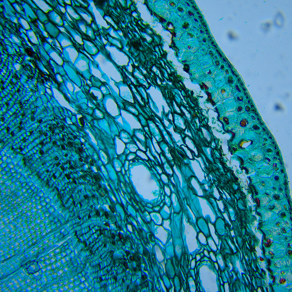
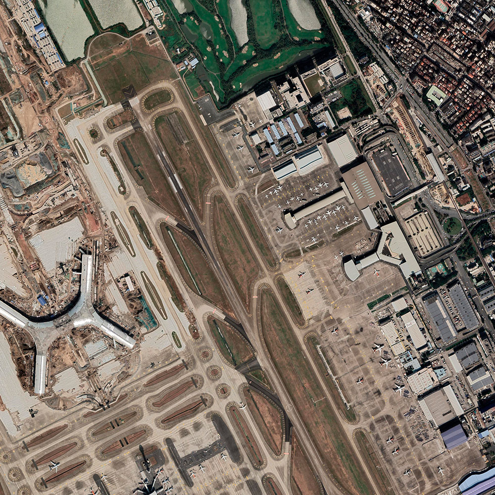
Biological and architectural formations as inspiration
In biological terms, mitosis is the process of duplication and distribution of chromosomes in preparation for cell division. On a geometric level, the division of cells or polygons is the core principle illustrated in this artwork.
This artwork captures a dichotomy of scale, offering a dual lens through which the minuscule intricacies and vast expanse of our world can be equally appreciated. Originating from a singular shape or cell, multiple divisions are applied, creating regions of contrasting densities, and to finally generate a functional tissue. The outputs display a wide variety but still form a coherent collection spanning a range from organic structures to architectural patterns.
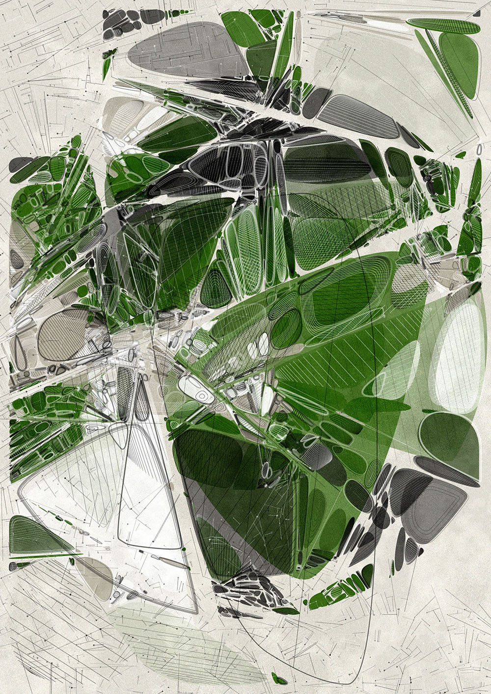
Construction
Initially, I construct a number of lines that are not allowed to cross each other. From these generated intersection points, new lines are created. Some of these are still visible in the design as background lines. Some have small circles at their endpoints, hinting at bezier anchor points as a constructive element.
These constructed lines also act as guiding paths for dividing several starting polygons. Some of these fundamental shapes overlap, adding layers and complexity to the design.
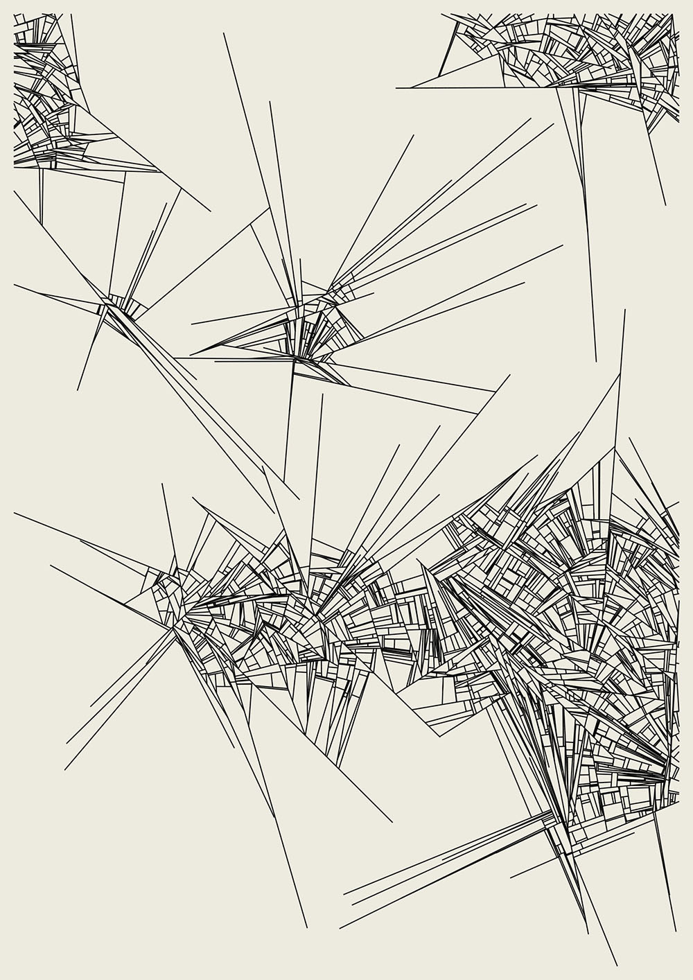

Background lines & polygon subdivision
Layout modes
The choice and placement of the starting polygons can greatly impact the final look. There are seven layout modes to consider:
- "Nucleus" features a central circle layered with larger background shapes.
- "Multi cell" consists of concentric circles of varying sizes, paired with sizable shapes.
- "Amoeba" positions inset Chaikin rounded rectangles at the composition’s center.
- "Hyphae", "Membranes", "Tubules", and "Organelles" each offer variations of columns and rows. These modes incorporate offsets and come in both variable and fixed dimensions.
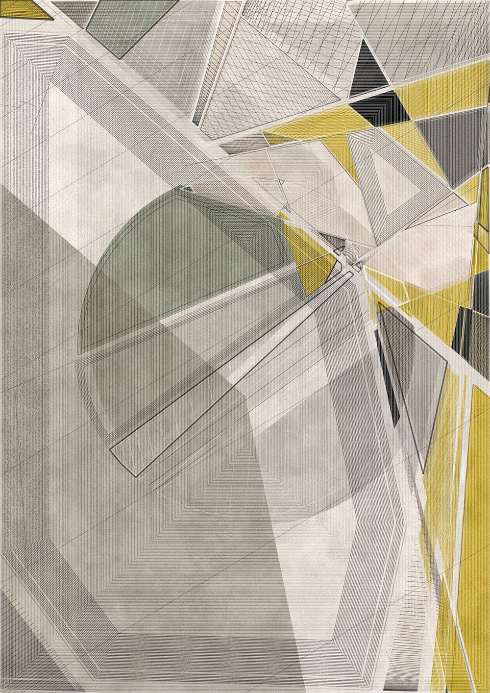
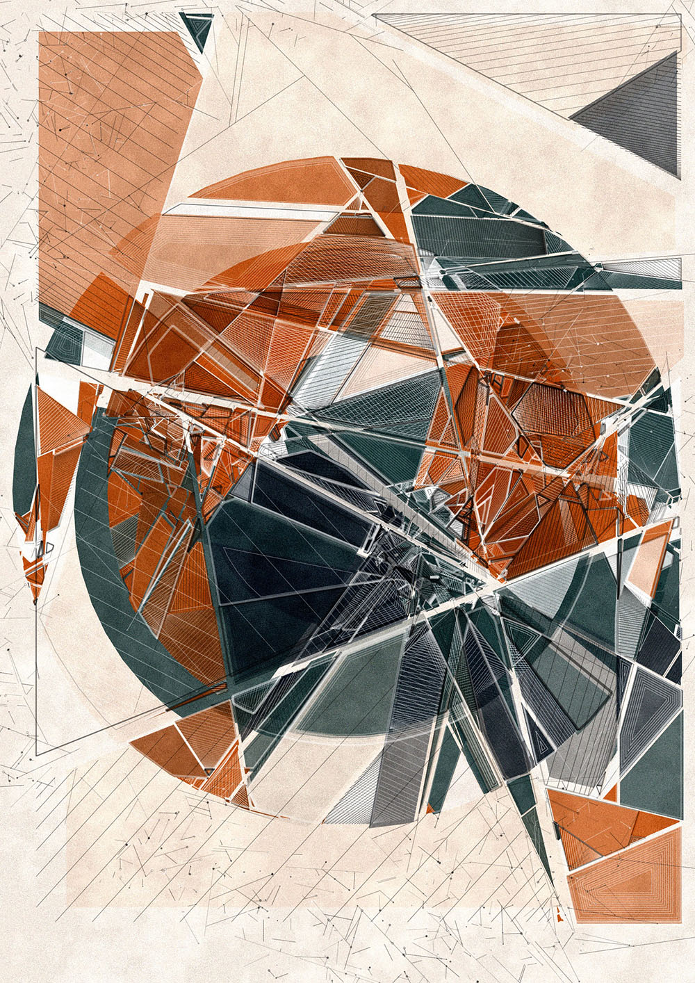
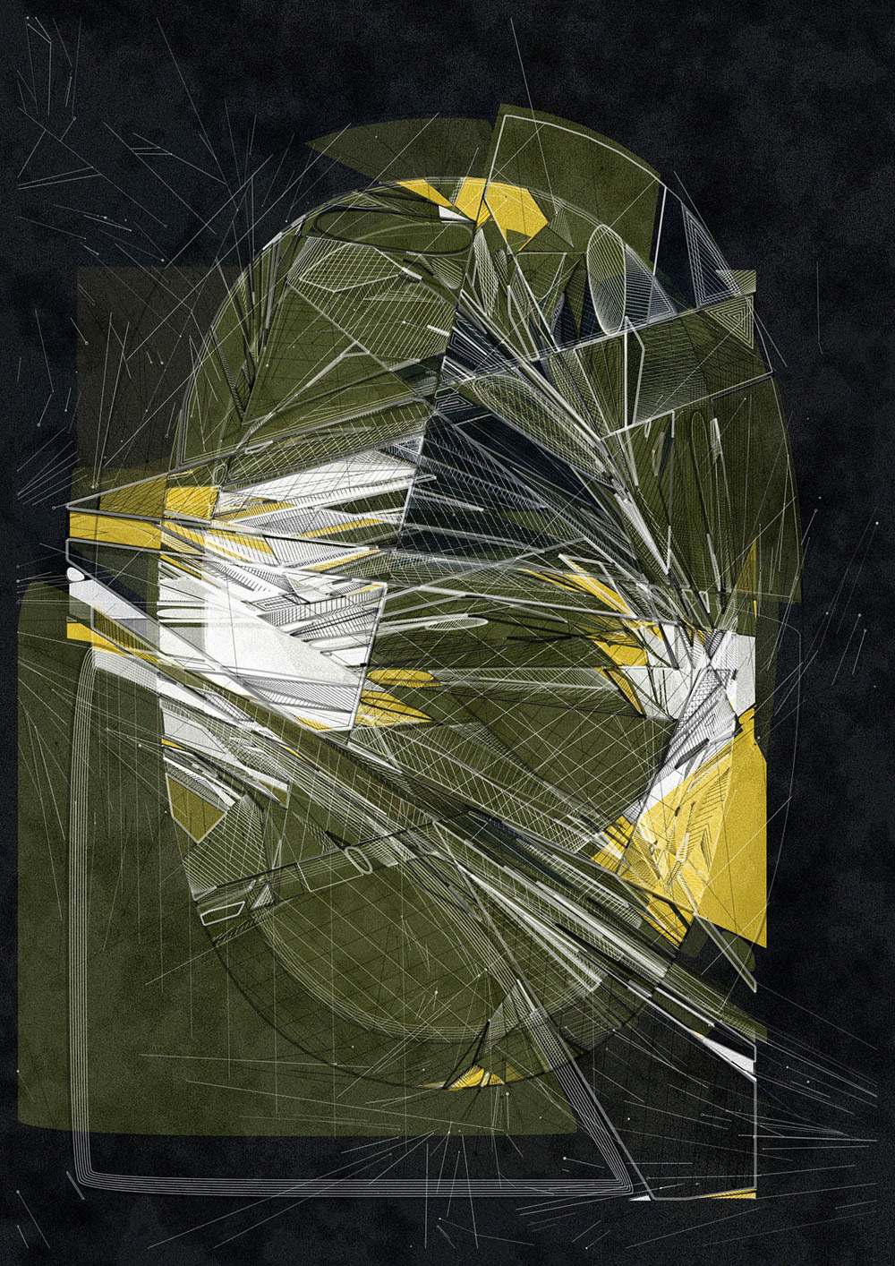
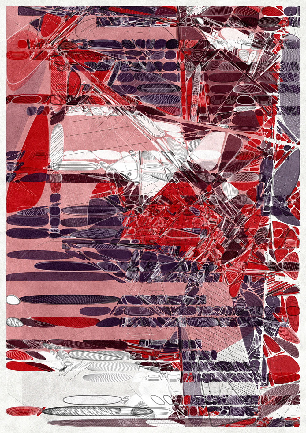
"Nucleus", "Multi Cell", "Amoeba" and "Membranes" layout modes
Color
Inspired by biological structures and processes, 25 distinct color palettes have been curated: Albinism, Monochromatic, Green Algae, Chlorophyll, Hemoglobin, Hydrolysis, Erythrocytes, Pheomelanin, Redox, Phycobilins, Cyanobacteria, Osmosis, Blue Algae, Hydrophilic, Phosphorus, Xanthophylls, Mycelium, Rhizosphere, Photosynthesis, Bioluminescence, Hypomyces lactifluorum, Carotenoids, Aposematism, Chloroplasts and Chromatophores. Each palette is a thoughtfully designed blend of a background color accompanied by 3 to 5 foreground colors. These foreground colors each carry a unique value, determining their likelihood of being incorporated into the design. Such a system enables the occasional introduction of contrasting hues and creating dynamic highlights within the composition.
The shapes emerging from the subdivision process are drawn as filled shapes with varying opacity, enhancing the tactile quality and nuance by blending the colors of the selected palette. Think of this stage as the fundamental layer or the underpainting. Additionally, these filled shapes are strategically offset based on their original positions and sizes, smaller shapes have a smaller offset compared to the larger ones.
The color assigned to a shape is derived from its position and its 2D Perlin noise value. By discretizing this noise value and mapping it to a position in the color array, colors are systematically arranged in designated regions, introducing a structured elegance to the overall design. It's noteworthy to mention that most palettes revolve around one or two dominant hues. Through extensive testing, I found that using too many colors can make a composition feel too chaotic.
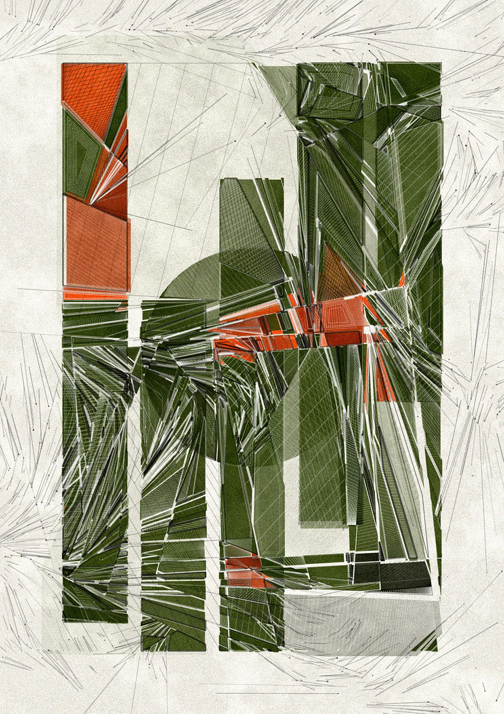
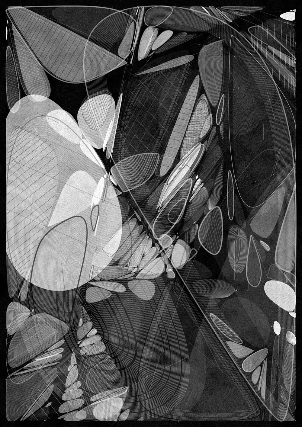
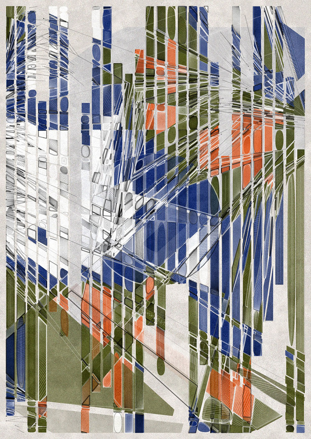
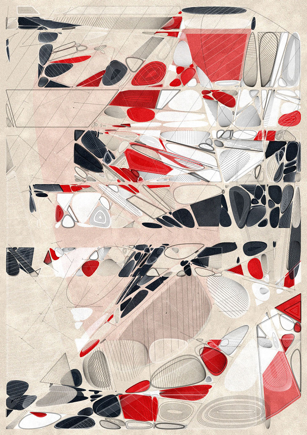

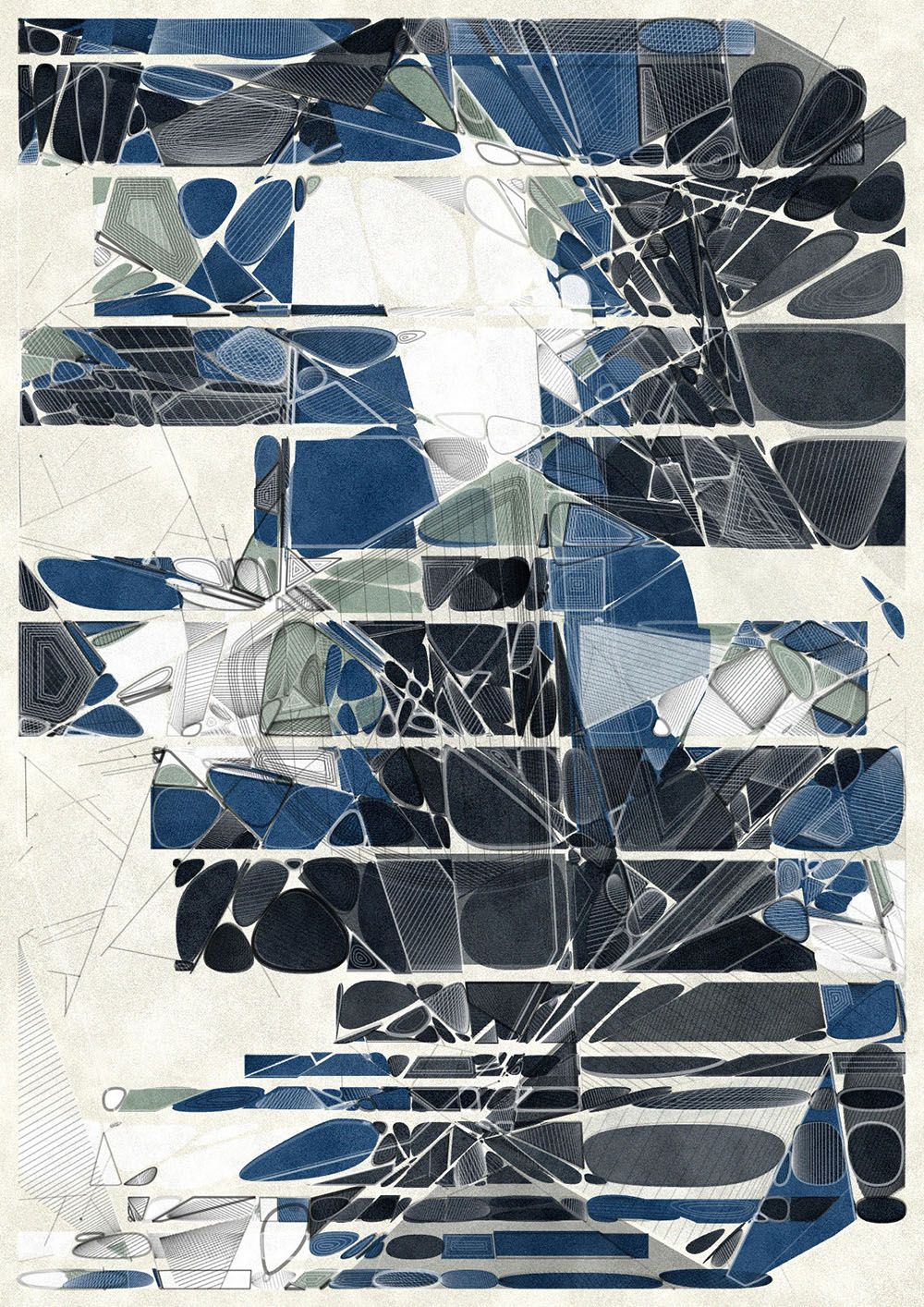
Color palettes Hypomyces lactifluorum, Monochromatic, Bioluminescence, Phycobilins, Photosynthesis, Cyanobacteria
Texture
The shapes emerging from the subdivision process are drawn as filled shapes with varying opacity, enhancing depth and nuance by blending the colors of the selected palette. Think of this stage as the fundamental layer or the underpainting. I use the p5 pixel array to modulate each pixel’s color values, applying two layers of grain.
The first layer utilizes two Perlin noise values to create a more unpredictable pattern. One is finely detailed, while the other captures larger spots. By experimenting with the noiseDetail function, I achieved a unique, parchment-like texture. Essentially, it adds or subtracts from the current brightness value of the pixel, tweaking the existing pixel brightness.
The next noise layer spreads more evenly throughout the image. Using Perlin noise again, I added a cloud-like touch by calculating a small deviation from the current RGB values of the pixel to create some subtle colored noise.
The introduction of these noise passes resulted in a small but noticeable increase in contrast in the underpainting. All outlines are layered on top of these noise passes, preserving the sharpness and clarity of the additional line work.
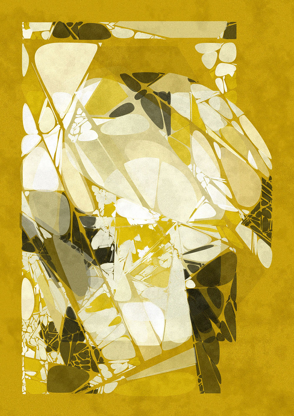
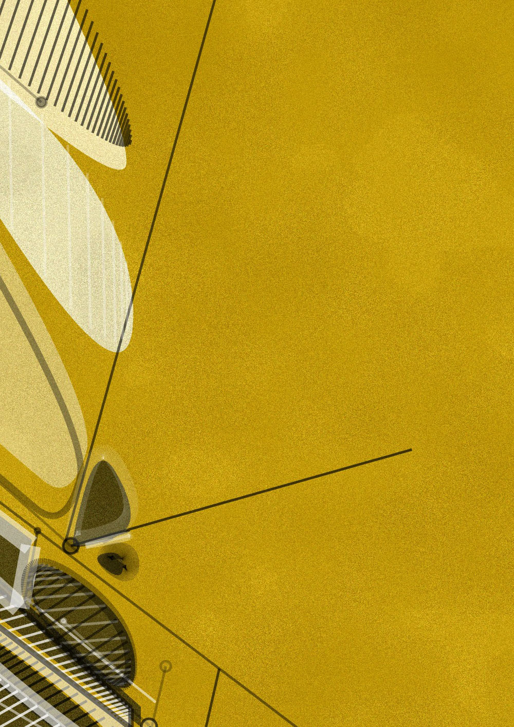
Underpainting and texture detail
For every resulting shape, several choices are made: whether the shape will be rounded, if its outline is shown, and if any internal hatching or inset shapes are visible.
Rounding
The chance of rounding shapes depends on a global parameter. Shapes that are more rounded evoke a more organic feel, whereas those less rounded lend a more structured aesthetic to the design. This accentuates the visual interplay between the two styles. In essence, this rounding serves as a visual metaphor for the concept of rounding seen in the mitosis process.
I experimented with various polygon rounding techniques. My initial approach involved using bezier curves, which produced promising results. However, I eventually settled on Chaikin rounding. Its advantage lies in the creation of rounding using numerous straight lines, simplifying subsequent intersection calculations for these shapes.
In simple terms, Chaikin rounding involves “cutting corners" at the 25% and 75% marks of each edge's length. This doubles the number of edges. Iterating this process several times increases the edge count but also enhances the visual perception of rounding.
Bezier rounding test and Chaikin rounding in the final design
Hatching
I wanted to add a hatching pattern to selected polygons to add more depth and surface detail to the design. To achieve this, I crafted a hatching algorithm, starting with a simple rectangle before advancing to a more complex polygon-based algorithm. This really deserves an article on its own as it proved to be more difficult than it looked at first sight. In general, I consider the bounding box of the polygon, draw its diagonals and then construct the hatching lines from these diagonals, based on the given angle. Next, I introduced an easing function to these hatching lines, producing gradient hatchings by gradually modulating the spacing between the lines.
Polygon (with Chaikin rounding) hatching with easing
Insets
For added dimension and detail, some polygons incorporate inset shapes. The challenge in developing a polygon offset algorithm — particularly for insets rather than outsets — was identifying when the shape begins to overlap itself. These inset shapes are evenly spaced at specific intervals, and to introduce variation, some are intentionally omitted.
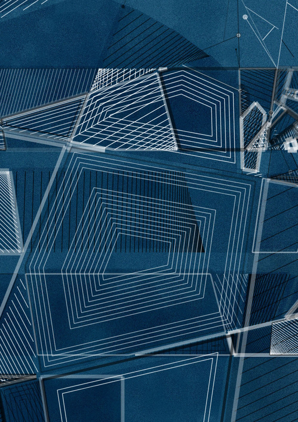
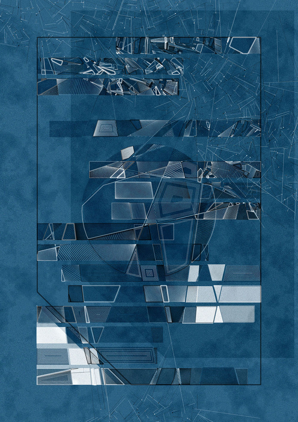
Inset detail and the overall composition
Borders
The design incorporates two distinct border types, each offering multiple configuration possibilities: one for the background lines and another for the polygon shapes.
For the background lines, the border can either be minimal or entirely absent. The absence of a border leads to a full bleed on this layer, allowing the design to seamlessly extend to the edges of the canvas. In addition, for the polygon shapes, there are various margin width options available, including an option with no margin, which similarly results in a full bleed.
The design features multiple border options, each creating a distinct visual impact. One setting allows the artwork to extend fully to the canvas edge, while others utilize varying margin widths, adding white space. The variation in these margins not only elevates the overall aesthetic but can also accentuate the shapes edges and background lines.
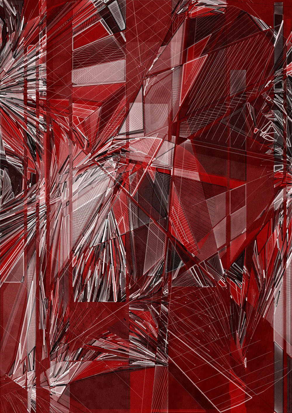
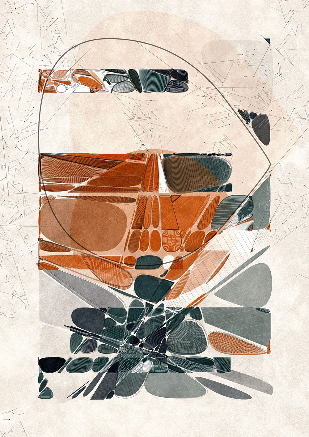
Designs with full bleed and maximum border
Animation and interaction
The final composition unfolds through a dynamic animation, layer by layer. Initially, viewers are presented with the pristine underpainting. As the animation unfolds, additional elements such as background lines, hatchings, insets, and outlines gradually overlay the base layer. For this animated revelation, all linework is segmented into smaller pieces. These segments are rendered based on their positions and the respective value extracted from a 2D Perlin noise field.
By pressing keys 0 to 6, you can export each output as a high-resolution file suitable for 300 dpi printing, ranging in sizes from A0 to A6, respectively.
To enhance user interaction, specific keystrokes allow individual toggling of layers like background lines, texture lines (hatchings and insets), and shape outlines. Each screen state (with certain layers toggled on or off) can be exported as hi-res jpg files, suitable for printing.