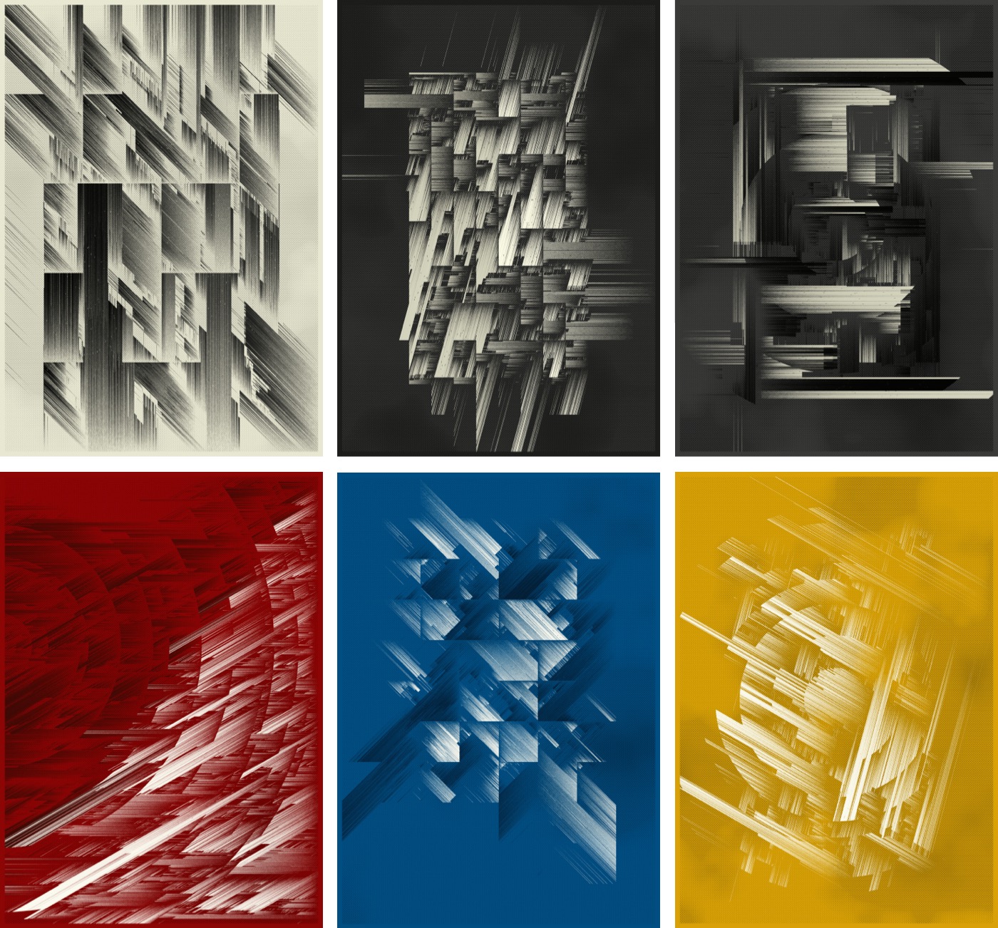
This generative algorithm explores the geometric theme of non-intersecting line segments. In short: no two lines in this design are allowed to cross each other. By incorporating various boundaries and shapes, constraining line angles, adjusting line density and applying several other techniques, a wide range of intricate compositions is produced.
The inability to truly connect can be interpreted as a metaphor for modern day life where we are flooded with digital means of communication but often struggle or fail to connect on a deeper, interpersonal level. This project thus reflects on the paradoxical nature of our increasingly interconnected yet isolated existence.
Line (non-)intersection
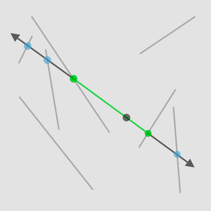
The fundamental concept of this work is based on an elementary algorithm that determines whether two line segments intersect. If an intersection occurs, I can calculate the point(s) of intersection and construct a new line segment using these points.
Generating lines
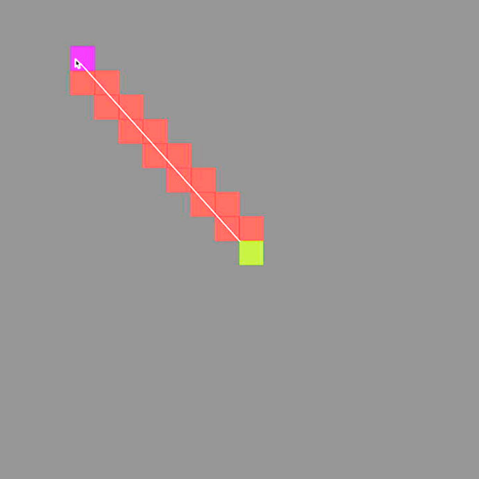
To be able to check if lines intersect, I first need to create some line segments. To determine the line’s position, I select a random point on our canvas and cast two rays in opposite directions (using an arbitrary angle for now) from this origin point. Next, I calculate all the intersection points with all the other lines for each direction of the ray. By selecting the two nearest intersection points for each direction, I create a new line segment that does not intersect with any other line. Finally, I add this newly created line segment to the existing list of lines for future checks.
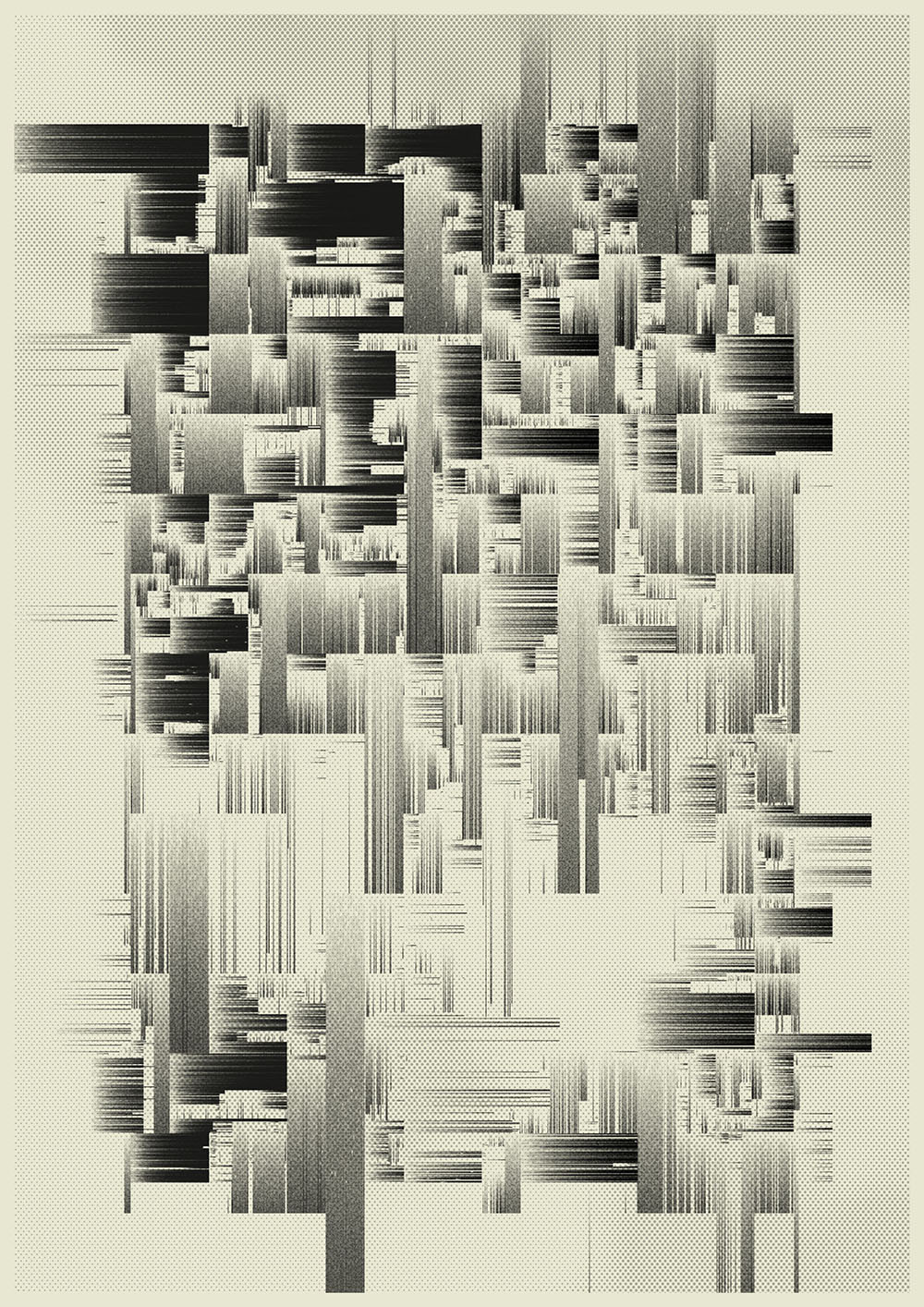
In this design, I generate random points within the canvas boundaries, utilizing a Perlin noise function to decide whether to accept or reject each point. Through this rejection sampling method, a greater variation in point distribution and, consequently, line density is achieved. This results in a more engaging and contrast-rich composition.
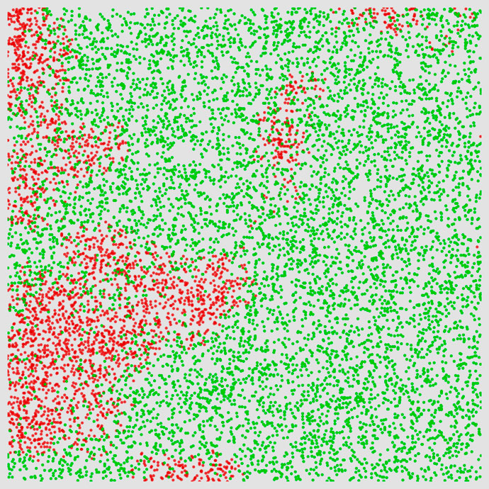
Line intersection and noise-based point rejection
Angles
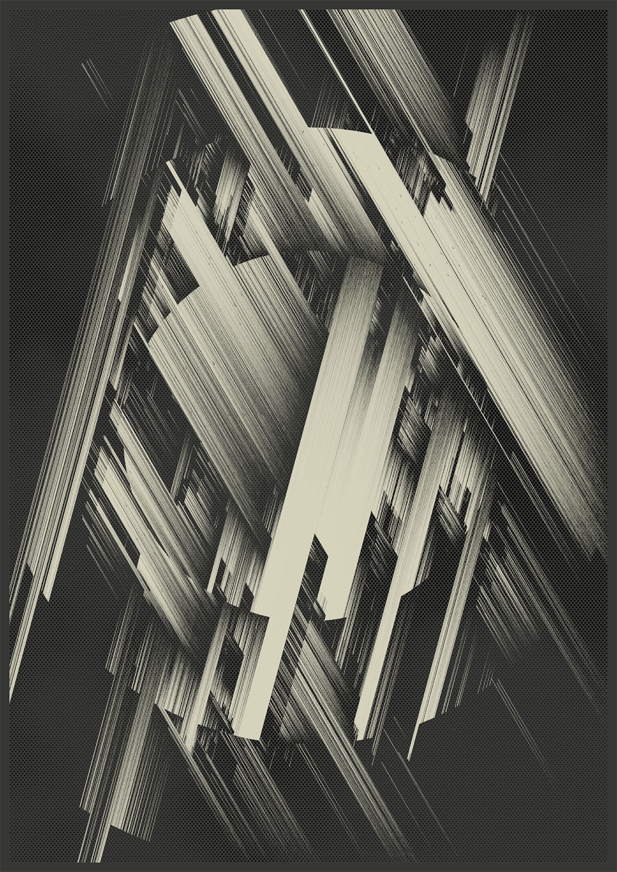
Rather than constructing each new line at an arbitrary angle, I specify a limited set of angles to use. Here, only two angles are selected, with equal probability. These two angles are not chosen randomly but are discrete values that are multiples of 15 degrees. By implementing a weighted choice function, the probability of obtaining 90° angles is increased.
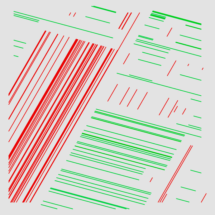
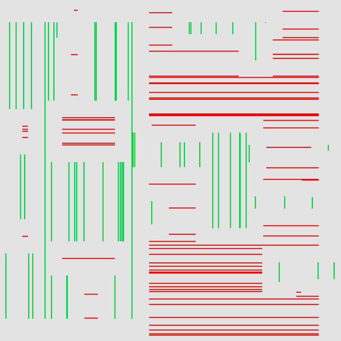
Discrete angles
Barriers
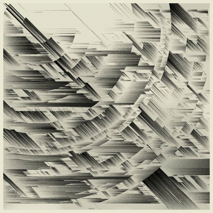
The next step involves introducing barriers into the system before constructing any other lines. A barrier is simply another straight line, but rather than being placed randomly on the canvas, it is part of an intentional shape, such as a square or a polygon. The addition of barriers significantly enhances the visual and compositional complexity of the design.
There are several barrier shapes that get selected by a weighted choice function, favoring some over others. The possible barrier shapes are: concentric and centered squares, randomly positioned or centered concentric circles, packed circles, a grid consisting of rows and columns, or specific combinations.
The outlines of these shapes are not continuous, rather they are divided into sections. Creating these gaps adds a playful element to the visual output. As a result, some lines extend beyond the boundaries of specific shapes, further contributing to the dynamic appearance.
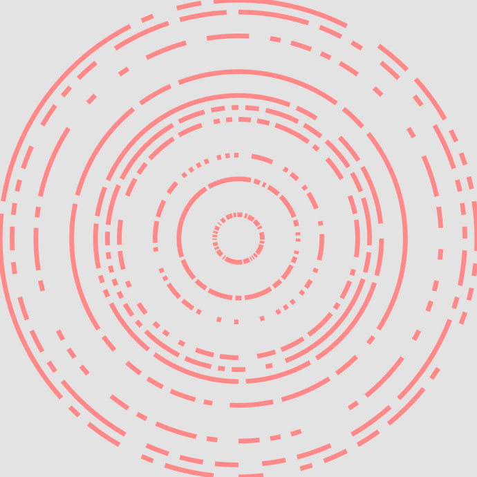
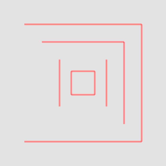
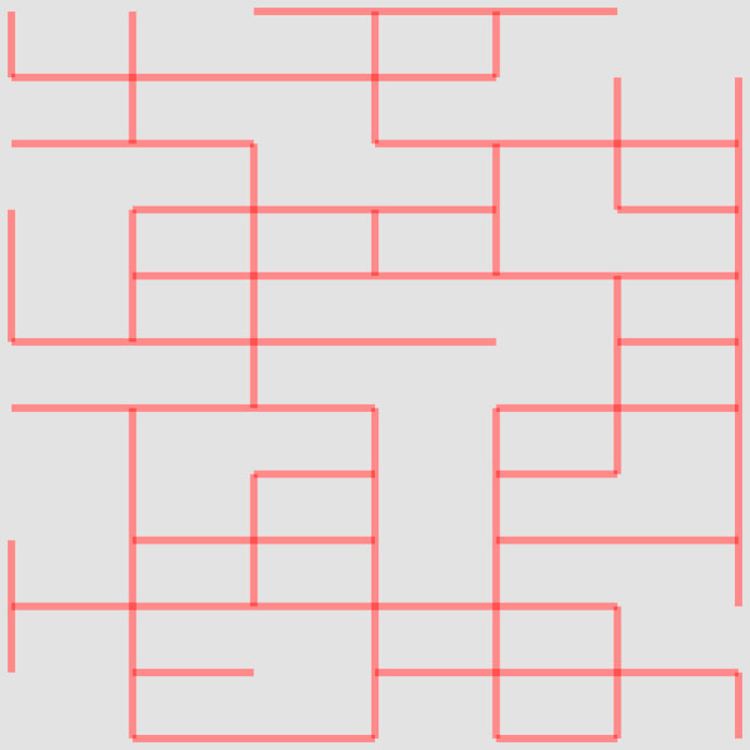
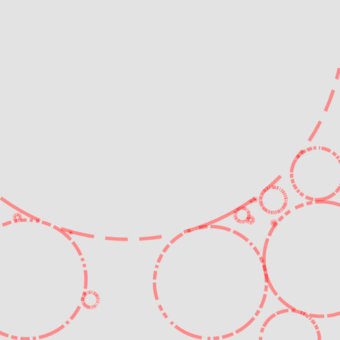
Barrier shapes
Optimisation
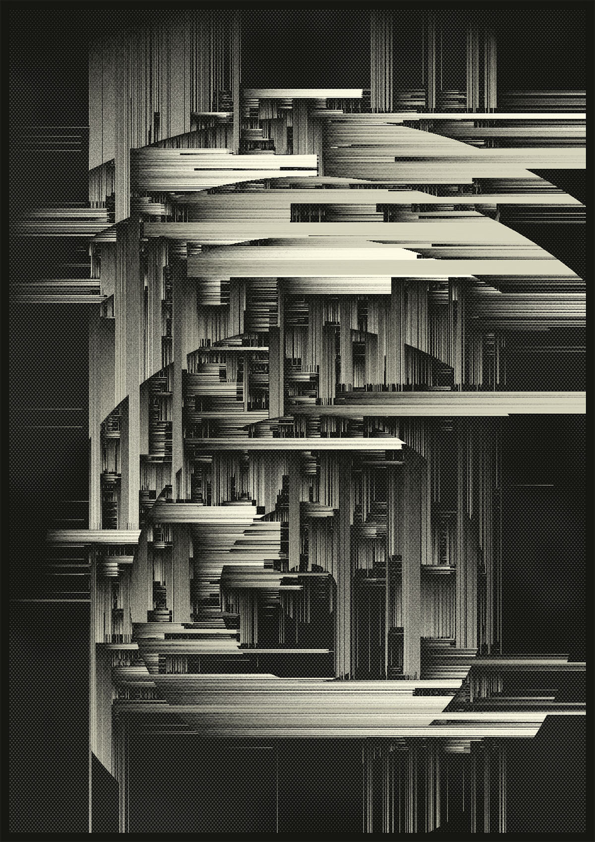
Since thousands of lines are drawn, a lot of intersection calculations have to be carried out. This naive solution to check intersections becomes increasingly computationally expensive due to the exponential growth of the required calculations.
During the development phase, this processing overhead became a significant obstacle, as I had to wait several seconds (sometimes up to a minute) for each test output to render. There had to be a more efficient solution to this problem, and that’s where spatial acceleration structures come into play.
In this specific case, a uniform grid, serving as a spatial data structure, proved to be a good fit because of the fairly even distribution of lines across the canvas. By dividing the canvas into a series of rows and columns, I create a grid of cells.
I can now determine which grid cells our ray intersects and only check line intersections with the lines present in that cell. This approach substantially reduces the number of intersection checks and calculations. Depending on the number of lines to be constructed (in this case, thousands), the efficiency improvement reached up to 7x. This enhancement allowed me to resume work without idly waiting for renders to complete, avoiding the frustration of staring blankly into the distance.
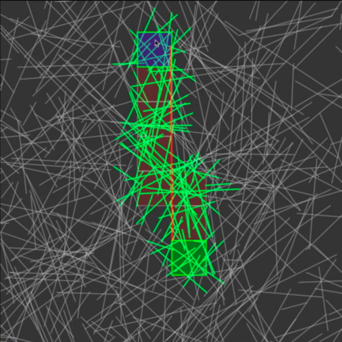
Intersection optimisation
Texture
To shift the design from a predominantly technical feel towards a more grounded and analog aesthetic some textural elements are introduced.
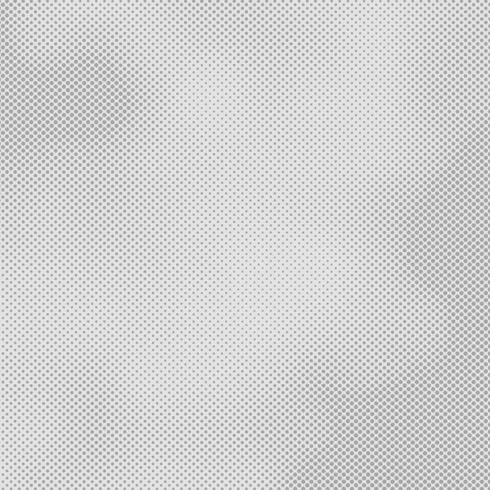
Firstly, halftone screening is used to create a subtle dotted pattern that is applied to the background. The size of the dots is modulated using Perlin noise values, adding variety and creating a more organic look. Initially, lines were drawn with a gradient, ranging from fully opaque to transparent. Later on, each line was broken up and drawn with slight variations in opacity for each segment, giving it a visually somewhat degraded or photocopied-like appearance. On top of this, some very short lines were scattered across the canvas to enhance the overall detail.
Lastly, to emphasize the printed aesthetic, a classic aspect ratio commonly used in poster design was adopted: the A series of the ISO standard, such as A4, A3, A2, … This particular choice contributes even more to the tactile, grounded feel of the design.
Background halftone screen and textured lines
Colors
During development I usually work with a very limited color palette to focus on form and composition initially. This project was no exception. As the design started to take shape, I tried to implement various color variations but I noticed I kept circling back to a monochromatic color scheme. To prevent the outputs from being exclusively monochromatic and incorporate some color variation, I opted for the three fundamental colors: red, yellow, and blue.
Each design consists of one background and two foreground colors. There are multiple color modes to determine which color is applied to which line. in “Mixed” mode, a random foreground color is chosen for each line. “Mono” uses a single color and disregards the second one. The “Angle” mode correlates the line color with the angle at which it is drawn. In “Noise” mode, the line’s center point and a 2D Perlin noise value are used to assign a color to the line. And finally there are three geometric modes — “Horizontal”, “Vertical” and “Diagonal” — that divide the canvas into two regions and apply the colors accordingly.